How data visualization helps us “see” better
In this article we’ll explore other industries using visualization, with an eye on common benefits that can be used in manufacturing design and planning.

In our last article, the concept of comprehensive visualization was introduced and a case presented for manufacturing design teams to use it as a tool to stay competitive in the Industry 4.0 age. Today, we’ll expand our lens to explore other industries using visualization, with an eye on common benefits that can be used in manufacturing design and planning.
Since communication is a fundamental tool for human interaction and visualization an evolution of communication, it is no surprise that visualization applications are virtually limitless. Let’s look at some interesting ones below.
Data Visualization
Famed British data journalist David McCandless describes the main value of data visualization: “By visualizing information, we turn it into a landscape that you can explore with your eyes, a sort of information map. And when you’re lost in information, an information map is kind of useful.”1 Well put. In fact, the “map” that visualization provides is downright essential when dealing with massive amounts of data that would otherwise be very difficult to process and extract actionable insight from.
By visualizing information, we turn it into a landscape that you can explore with your eyes, a sort of information map. And when you’re lost in information, an information map is kind of useful.
David McCandless
Scientific fields like astrophysics and medicine provide poignant examples of dealing with data on a massive scale. Astronomers run galaxy formation simulations where each “snapshot” can exceed 25 terabytes. Genomics scientists use visualizations to search for patterns, in the context of a single human genome containing 100 gigabytes of data, on the quest for personalized medicine. Even in settings where the data isn’t quite so massive, visualization still helps to analyze statistics over long periods of time. In professional and collegiate sports, for example, coaches use data visualization of single-game, season or career statistics for scouting and player development. Like scientists and athletic directors, manufacturing design teams should expand their thinking to include very large data sets to optimize their business operations; visualization can help with that.


“Nine Year Microwave Sky” – The detailed, all-sky picture of the infant universe created from nine years of WMAP data. By NASA / WMAP Science Team [Public domain], via Wikimedia Commons.
Besides adeptly handling massive data, data visualization can also be very useful in settings where the data and its observers can interact, in a 2-way data flow. Nowhere is this more useful than in observing people themselves. The field of education, for example, is making great strides using data visualization as a feedback tool to improve the education experience through customized teaching. At an education data visualization summit in 2014, US Department of Education executive Kathleen Styles noted “In the past, we’ve known our content. In the future, we’ll know our learners.” Manufacturing planners and executives, too, can think about what data their employees, customers or other stakeholders may be able to contribute in the quest for optimization and delivering value. Again, visualization can be an elegant and expedient way of observing such data and making it useful.
Finally, and perhaps the most exciting, data visualization opens up abilities to analyze data in a growing number of new ways; and these abilities evolve every day. Economists and demographers are employing “data cartography”, creating new maps along political, economic and other societal axes instead of geographical ones. Pew Research’s grand “Next America” project provides engaging visuals to illustrate the dramatic transformation of the US population in terms of age and race. The basic tenet of insight is that non-obvious results are the key to finding value in data. Visualization, as a powerful means to uncover that insight, can make data meaningful, impactful and even inspiring.

Social Network – By Martin Grandjean [CC BY-SA 3.0], via Wikimedia Commons.
Simulation
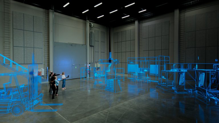
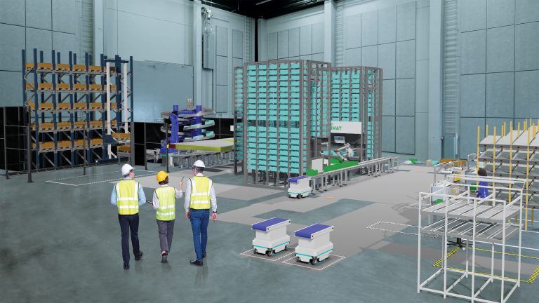
The oldest of visualization technologies, simulation has made leaps and bounds since 1958’s fabled Tennis for Two rudimentary computer game. Today’s simulation technology can be found in fields as varied as healthcare and military to entertainment and disaster preparedness. Inextricably linked to modern engineering, simulation is vital to architectural and urban planning, as well as automotive and aviation R&D. But the real treasure (and what we are most excited about) lies in tying everything together in a holistic sense, comprehensive visualization. With comprehensive visualization, not only is it possible to render a virtual environment providing a complete view of once-disparate systems, but also to simulate processes in real time allowing for discovery of anomalies and nuances that impact desired outcomes. Comprehensive visualization is also a good way to observe a large space (like an enormous factory) with an eagle-eye view, much like data visualizations allows for observation of a large data set in a meaningful way. The value of such a tool in the planning process is immeasurable.
With comprehensive visualization, not only is it possible to render a virtual environment providing a complete view of once-disparate systems, but also to simulate processes in real time allowing for discovery of anomalies and nuances that impact desired outcomes.
Whether data visualization or visualization in a more traditional sense like simulation, visualizing is unquestionably a means to better immersion, engagement and recall than older tools using non-active data. Visualization encourages rapid understanding across teams, making sense of data with great volume, velocity and variety. It brings data to life and puts it in story form, how people want to consume it; hitting a different part of the brain that encourages retention. In the age of big data, visualization provides the missing link: utility. The bridge between human cognition and automated analysis, it can give manufacturing design teams the ability to literally “see” their business like never before.
1. McCandless, David. “David McCandless: The Beauty of Data Visualization.” TED. N.p., 1 Aug. 2010. Web. 15 Nov. 2016.
Further reading
Digital twin in manufacturing: what it is, how it works & why it matters
Learn what a digital twin in manufacturing is, how it works, and how manufacturers use digital twins to reduce risk, boost efficiency by up to 30%, and accelerate production, with...

Manufacturing experts on why early simulation and people-first automation matter
Earlier this year, Visual Components hosted a roundtable discussion titled “How to Achieve Efficiency in Production,” bringing together Finnish experts from industry and academia to share their insights on how...
The future of automated manufacturing (and why humans still matter)
Automation in manufacturing has been evolving for decades, but its true impact isn’t in replacing people, it’s about making them more capable. We spoke with Mika Anttila, one of Visual...